
Rethinking Activity Reviews
Improving GetYourGuide's review flow — and unlocking a new content engine for the marketplace.
- Problem
- Outdated, low-quality reviews were eroding trust — the review form hadn’t changed in years.
- My role
- Sr. Product Designer + Content Designer + Product Lead
- Outcome
- +65% form completion · 1M+ photos in 10 months · +4.8% CR
- Timeline
- Q3 2023 · Team: PM, UX Researcher, Data Analyst, FE/BE Engineers
Some confidential figures are omitted to respect my NDA.
Great activities, forgettable reviews.
At GetYourGuide, my team (ACT — Activity Content Team) owned one question: is this activity worth booking? We managed how reviews were collected and shown.
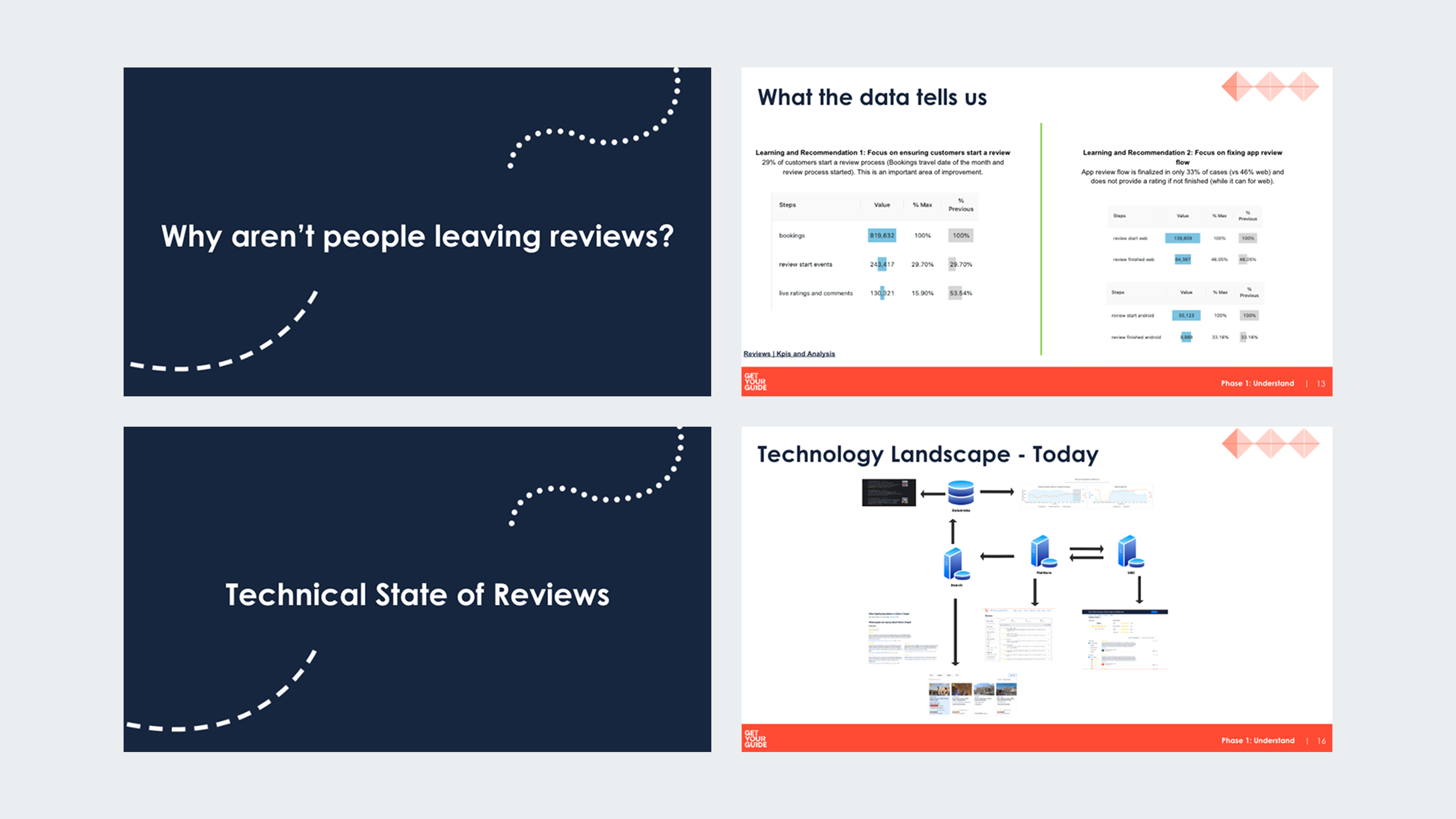
The problem was compounding. Our reviews were going ( stale ) — a low completion rate on the review form meant fewer, older reviews on our activity pages. Previous teams had tried to fix the form and stalled; it had sat untouched for years until we took ownership.
The pain points were clear: ( inconsistent across platforms ), ( isolated systems ), ( unintuitive design ), and ( no clear owner ).
Two goals: one cohesive experience across platforms, and a higher completion rate.
I held the pen across design, content, and product.
- Senior Product Designer — competitor research, user journeys, IA, visual & interaction design, illustration, motion, prototyping, validation, and additions to our design system.
- Content Designer — the messaging through the whole flow, and the structure of the data we collected.
- Product Lead — bridging business and user needs, and aligning Data, Merchandising, Legal, and Customer Care around one end-to-end solution.
Move fast, then go deeper.
Lean UX.
My PM and I ran a week of working sessions to shape the vision and main flow — lightning talks and Q&A across UX, Product, Engineering, and Analytics so everyone shared one picture of how a review actually gets submitted.
A better question.
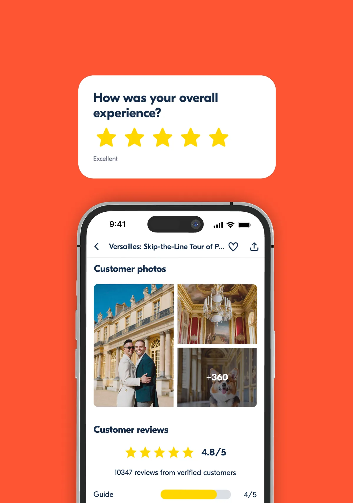
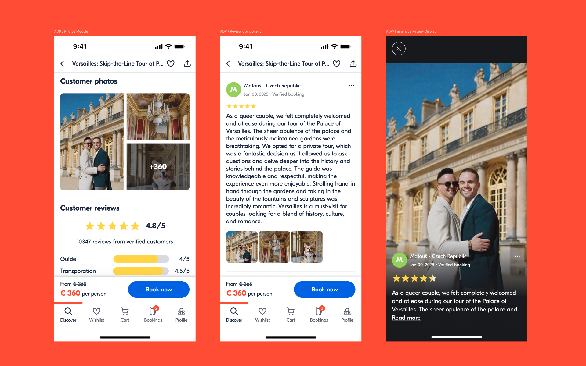
Prototyping the low-fi flow surfaced the real gap: when you're trying to express an experience, what's more powerful than words? ( Photos. )
Research to be sure, not to assume.
With our UX Researcher I ran semi-structured interviews with power users and prospective customers, exploring three things: the ( role ) reviews play in deciding, what makes a review feel ( useful ), and what actually motivates people to ( contribute ) one.
What we learned — what makes a review great:
( Recent ) (< 90 days) · ( Well-rated ) (4★+) · ( Concise ) (< 300 chars) · ( Honest ) (the good and the bad).
And two kinds of reviewer: The Contributor (wants to write detailed reviews) and The Evaluator (wants to rate, not write). We designed for the Contributor without hurting the Evaluator — because richer reviews meant better inventory quality and new marketplace signals down the line.
A form redesign became a zero-to-one bet on photos.
The research reframed the project. Adding ( customer photos ) shifted us from “improve a form” to “build a content system.” With leadership backing, we spun up a cross-functional UGC task force (my team + Legal, Customer Care, Merchandising) and mapped an entirely new review flow — clarifying the systems and owners for every piece.
I benchmarked direct and indirect competitors, then focused the first release on ( native apps ) — where most people review, right after their activity — while designing so the solution scaled to Desktop and Mobile Web.
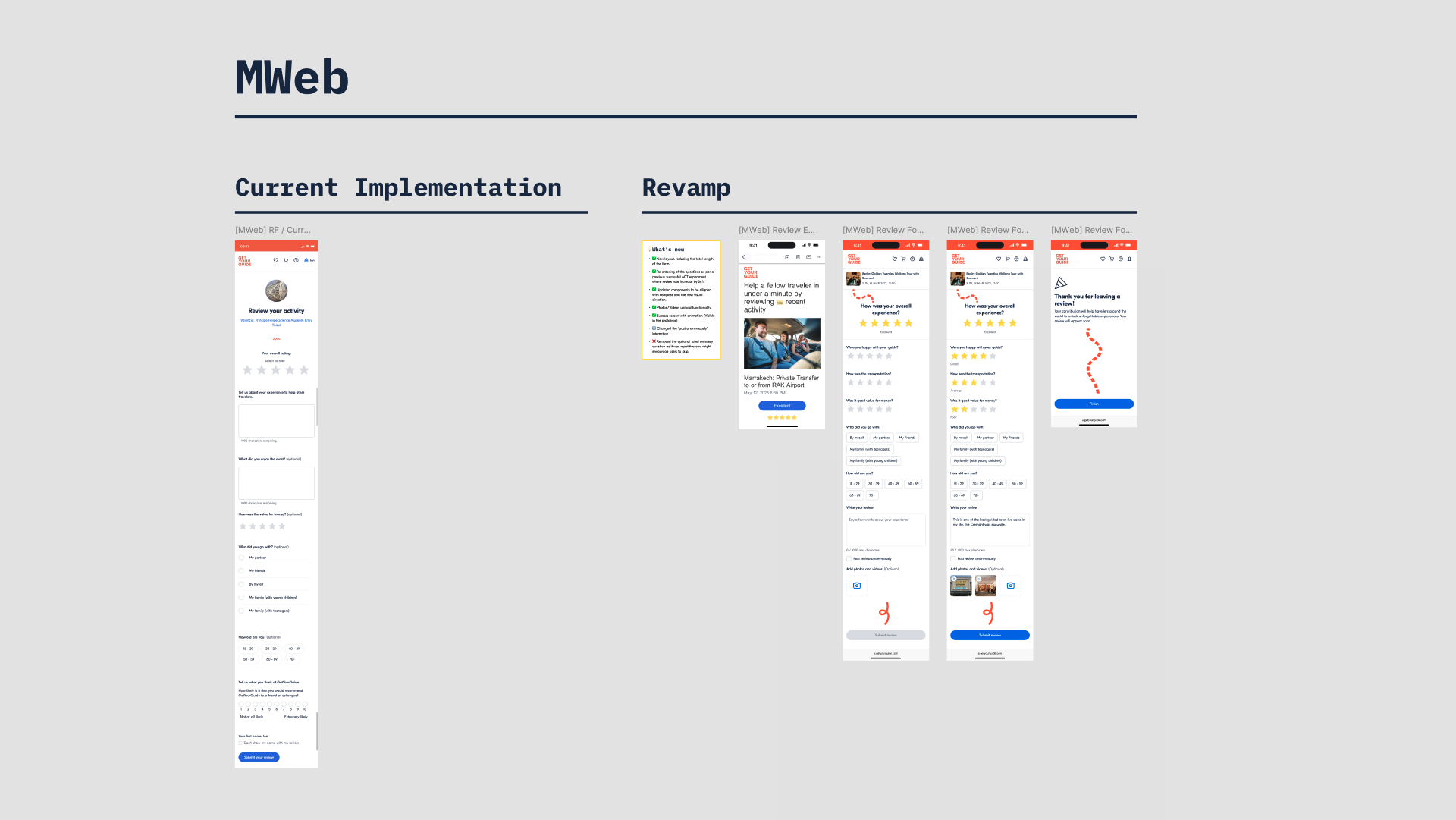
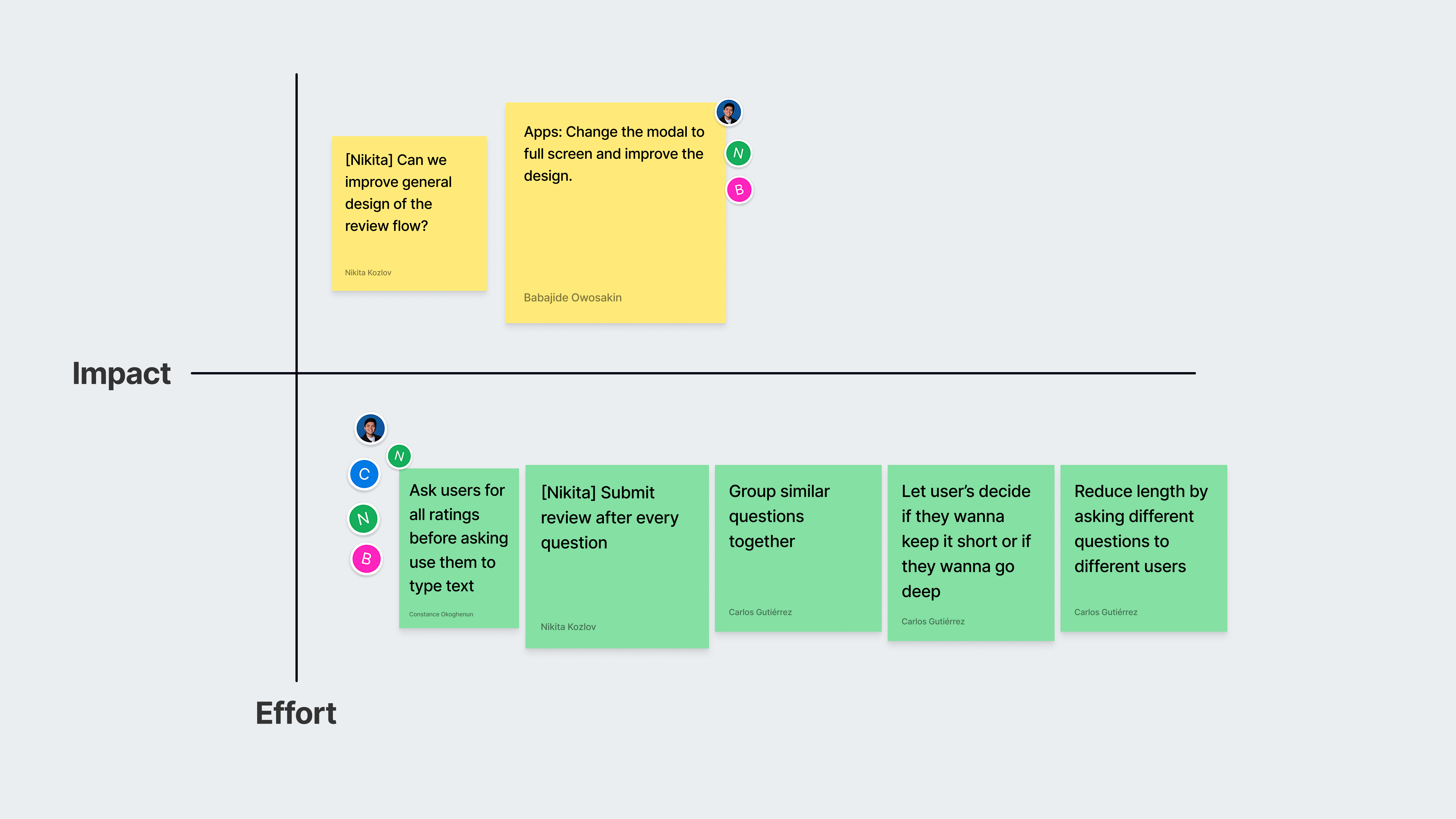
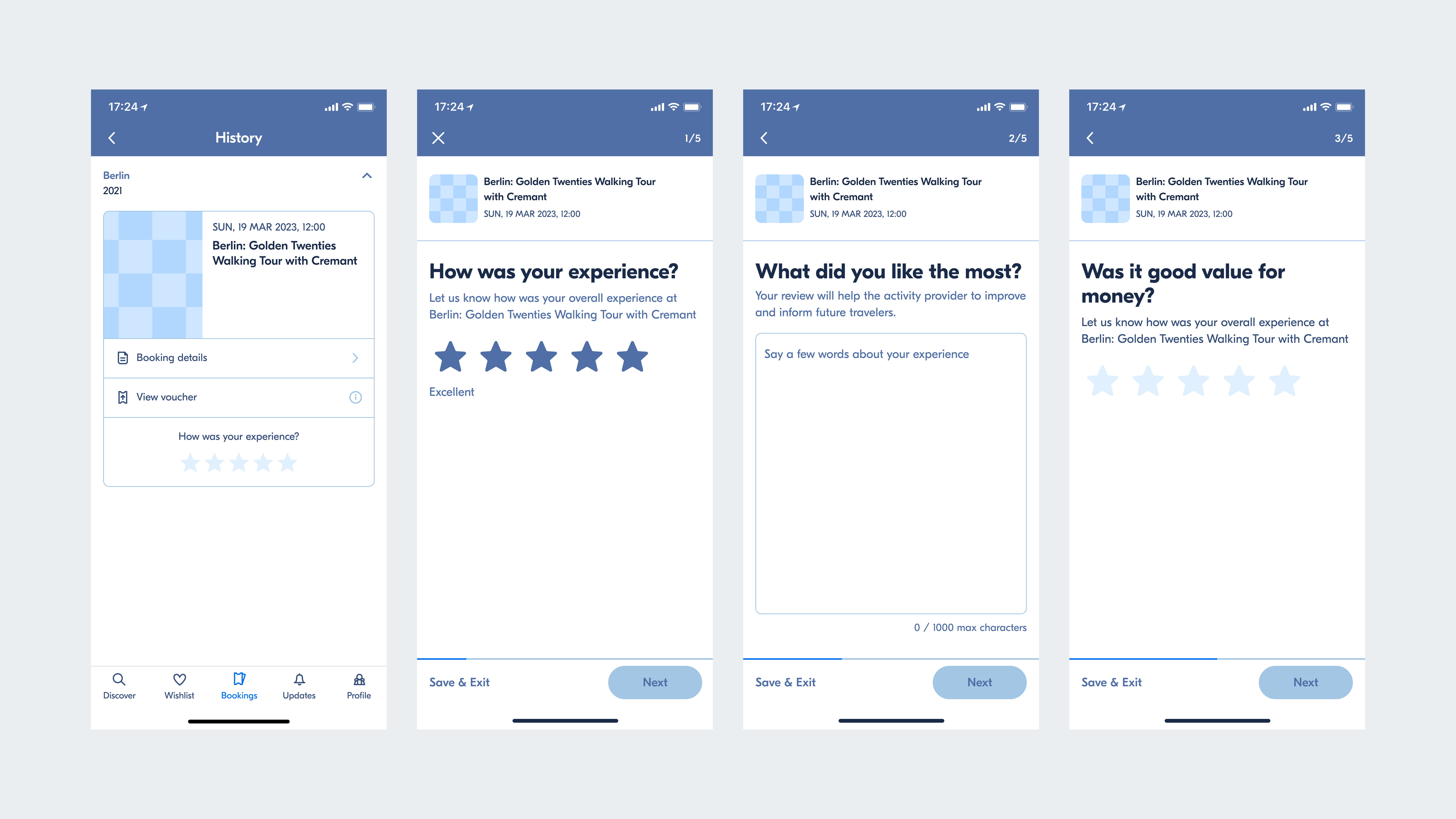
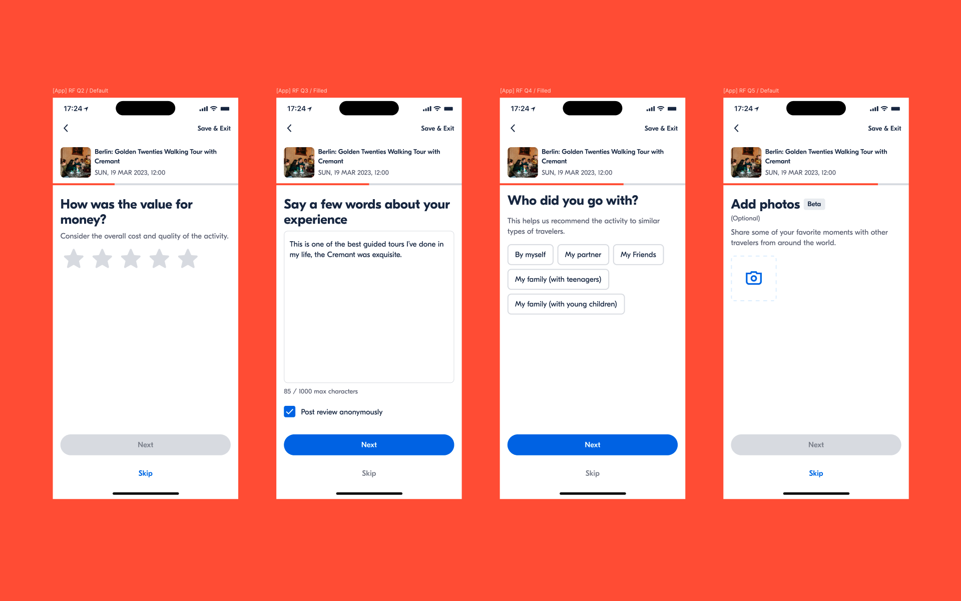
One flow, tailored questions, room for photos.
- Tailored templates. We stopped asking everyone the same questions regardless of what they booked — new templates matched the booking and gathered better signal.
- Photo upload, built into the form, plus a new way to show customer photos on the Activity Details Page.
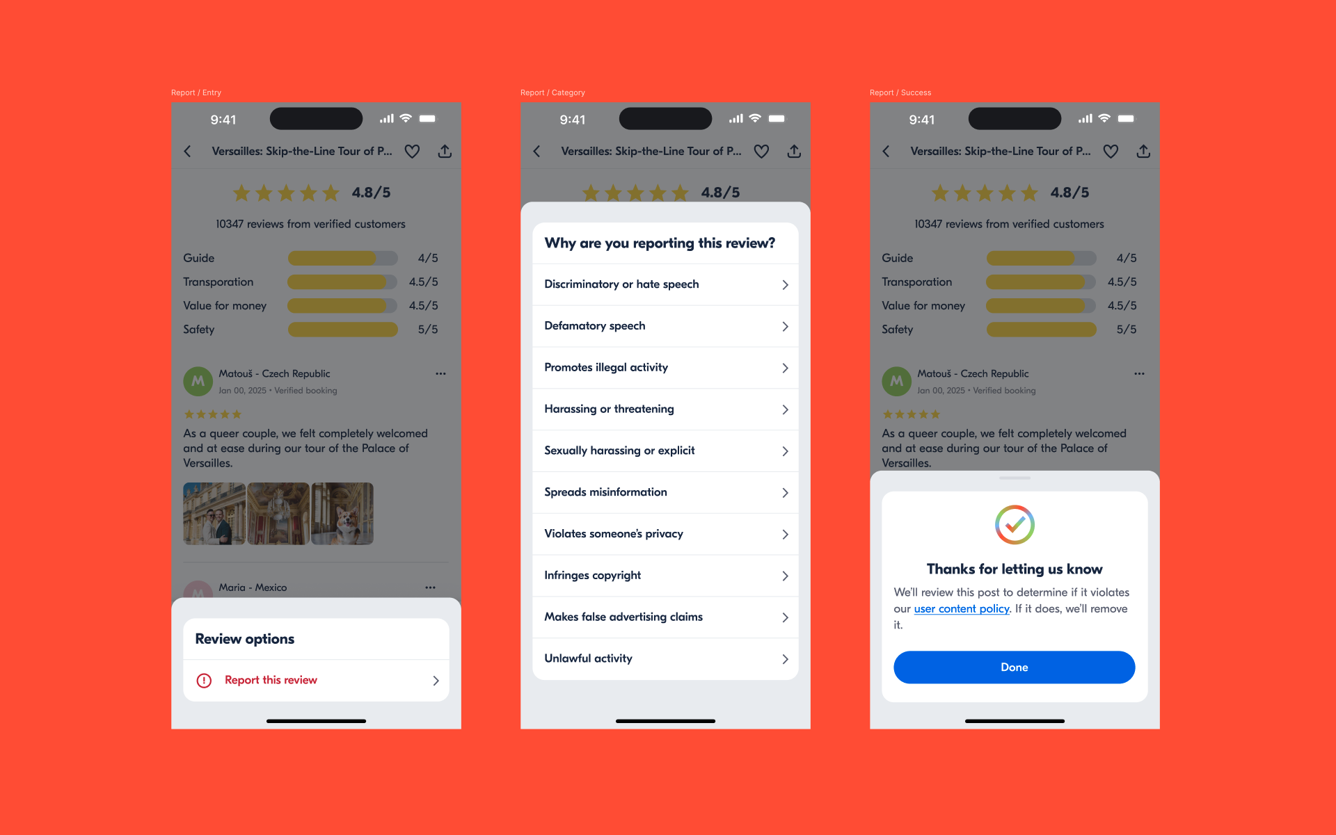
- Legal by design. Mid-project the EU's Digital Services Act passed; I designed the content-reporting flow so we were compliant from day one.
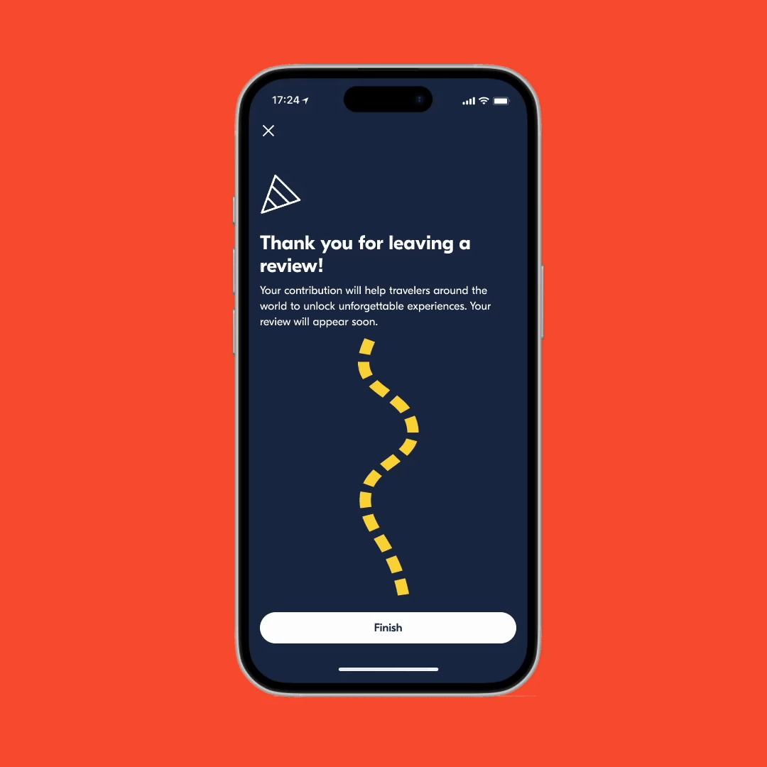
- A moment of delight. A small success animation — a thank-you to people who took the time to review.
We split the launch into three experiments to isolate impact: completion rate, photo engagement, and photos on the ADP.
The numbers moved — and so did the strategy.
This work directly shaped GetYourGuide's 2024 content strategy — other teams across the funnel began leveraging reviews and photos to build reassurance.
What I took from it.
- Design for the user, not for yourself. Working in-house daily, it's easy to design for your own habits. Research is what confirmed photos were a real user need, not just my hunch.
- Over-communicate without shame. Keeping Legal, Care, and Merchandising moving in parallel took relentless, repeated alignment — and it's what made a zero-to-one project ship.
- Growth over comfort. Reaching beyond my team's usual scope into legal, technical, and support systems is where I grew the most.
It stopped being a form and became a content engine for the marketplace.
