
Connecting Farmers with Suppliers
Agrishop Finder: empowering farmers through market transparency.
- Problem
- After diagnosing a crop disease, farmers spent 24–72 hours finding the right treatment at a fair price.
- My role
- Sr. Product Designer — product & content design, UX research
- Outcome
- +85% booking completion · +38% satisfaction · 3× engagement (vs. MVP)
- Timeline
- Q4 2021 · Team: Head of Product, UX Researcher, Data Scientist, FE/BE Engineers
Some confidential figures are omitted to respect my NDA.
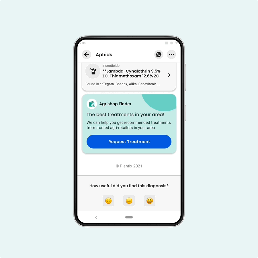
Diagnosis wasn't enough.
Plantix helps farmers diagnose and treat crop problems. Our value is to ( enable better decisions ) — but we learned that information alone doesn't solve a sick crop. So we set out to connect farmers who needed a specific product with nearby retailers who stocked it. (Live in India.)
How might we make it easier for farmers to find the right products to treat their crops?
The stakes were real: our research found ( 50% of products farmers buy are unnecessary ), costing them up to ( 30% of their income ). And after we recommended a treatment, it took farmers ( 24–72 hours ) to actually find it — forcing a choice between days of travel and negotiation, or staying to tend their crops.
From research to handoff, end to end.
As Senior Product Designer I owned competitor research, visual explorations and illustration, IA and user flows, layout, copywriting, feedback rounds, prototyping, validation, final mockups, and the development handoff.
In parallel I was updating our visual language and design system, which sped the path from wireframe to hi-fi.
Validate the need, then the shape of the solution.
Hypothesis: farmers in a crop emergency are vulnerable to being taken advantage of; Plantix can lower the stress so they make calm, informed decisions.
Is the need still real?
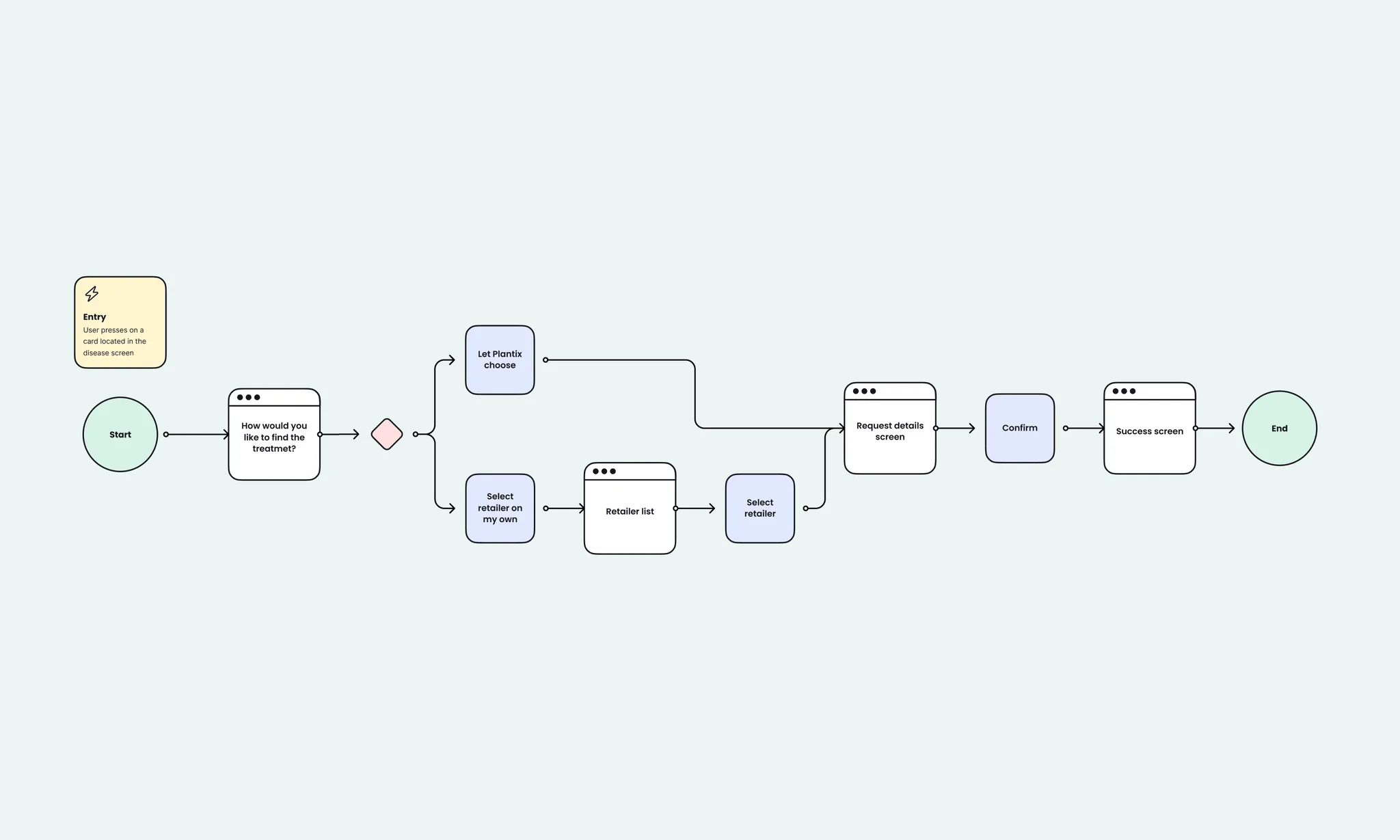
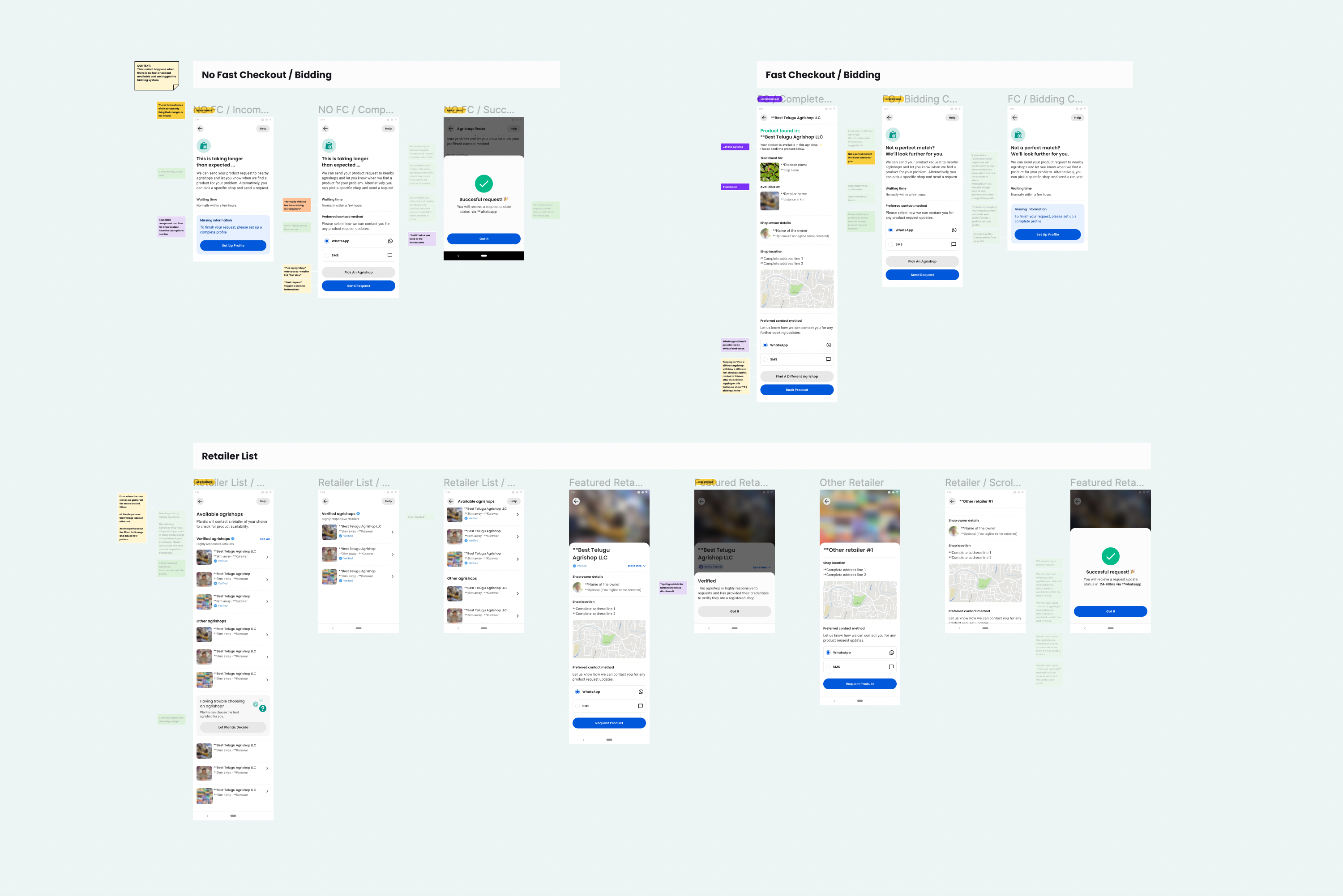
A ( fake-door ) test after diagnosis had shown 90% of users wanted to be connected to a nearby retailer — but that was 2019, pre-COVID. We rebuilt a fresh MVP to confirm it still held in 2021, testing ( two flows ): dealing with retailers directly, vs. Plantix acting as a ( trusted middleman ).
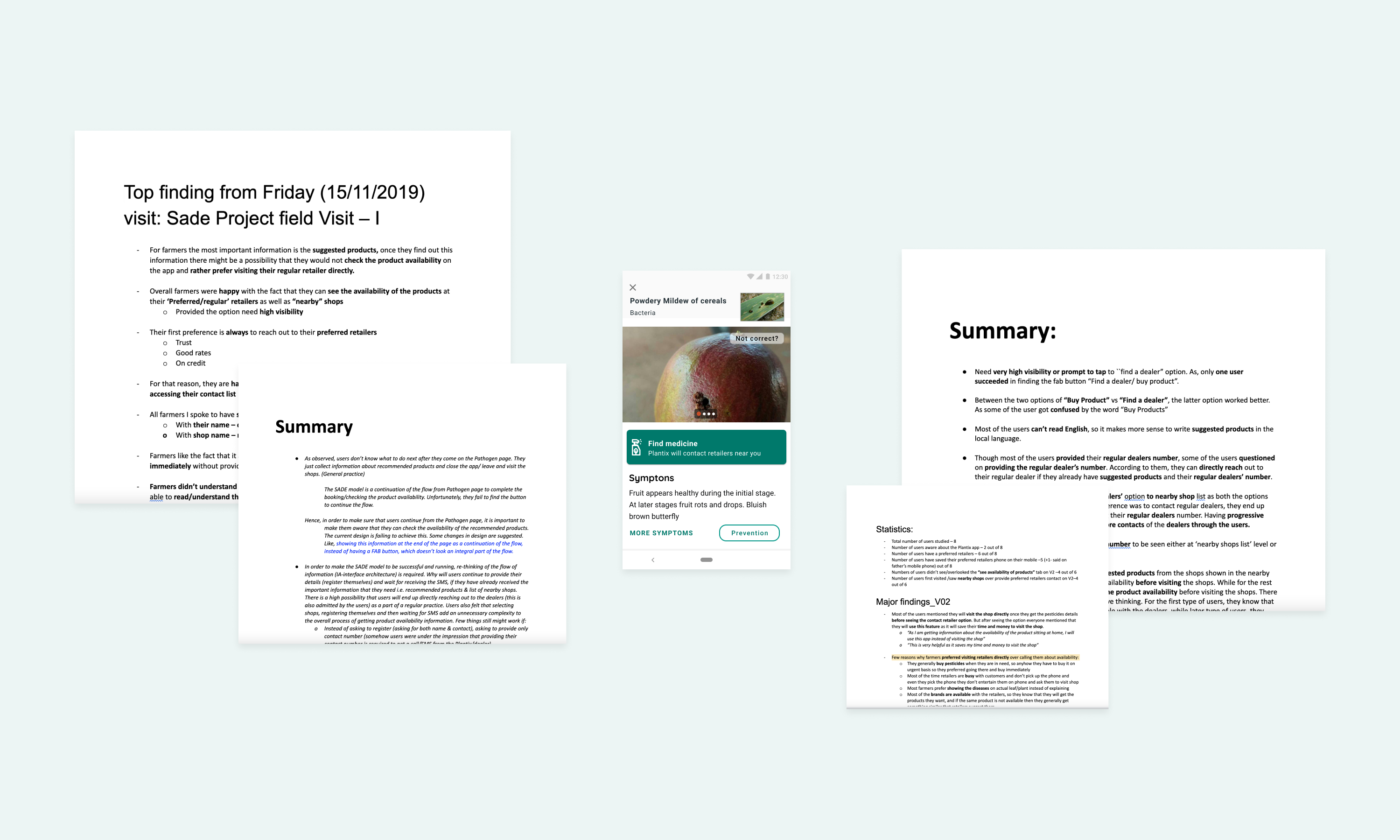
Listen at scale.
Alongside testing, we ran moderated phone interviews with 400+ users. What we heard reframed the design:
- 94% assumed they'd be charged at some point
- 51% found it unclear how a retailer was selected
- 75% forgot about a request they'd made out in the field
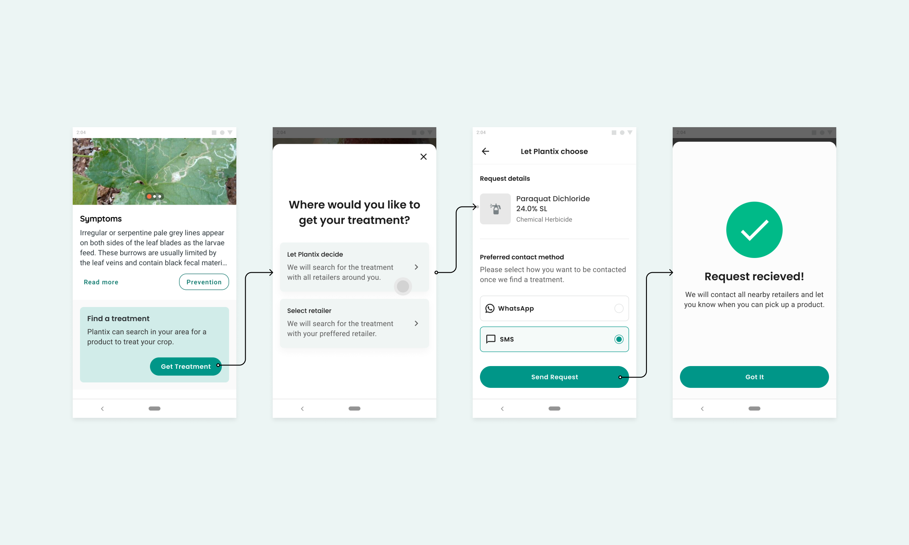
- 62% preferred letting ( Plantix choose ), afraid of choosing wrong
Voice of the user:
“Tell me where the drugs are, I need to go now!” — Hitesh, 34
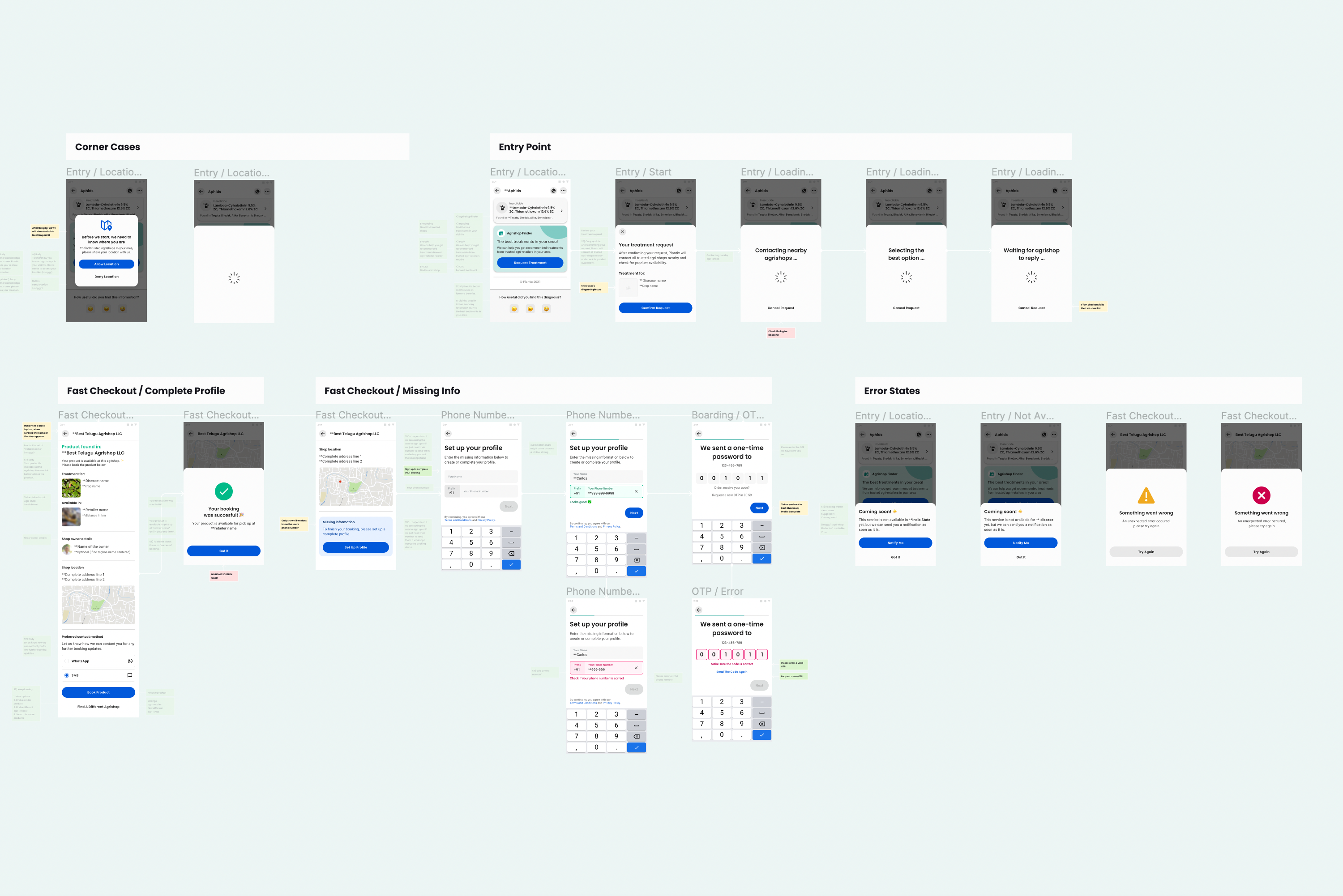
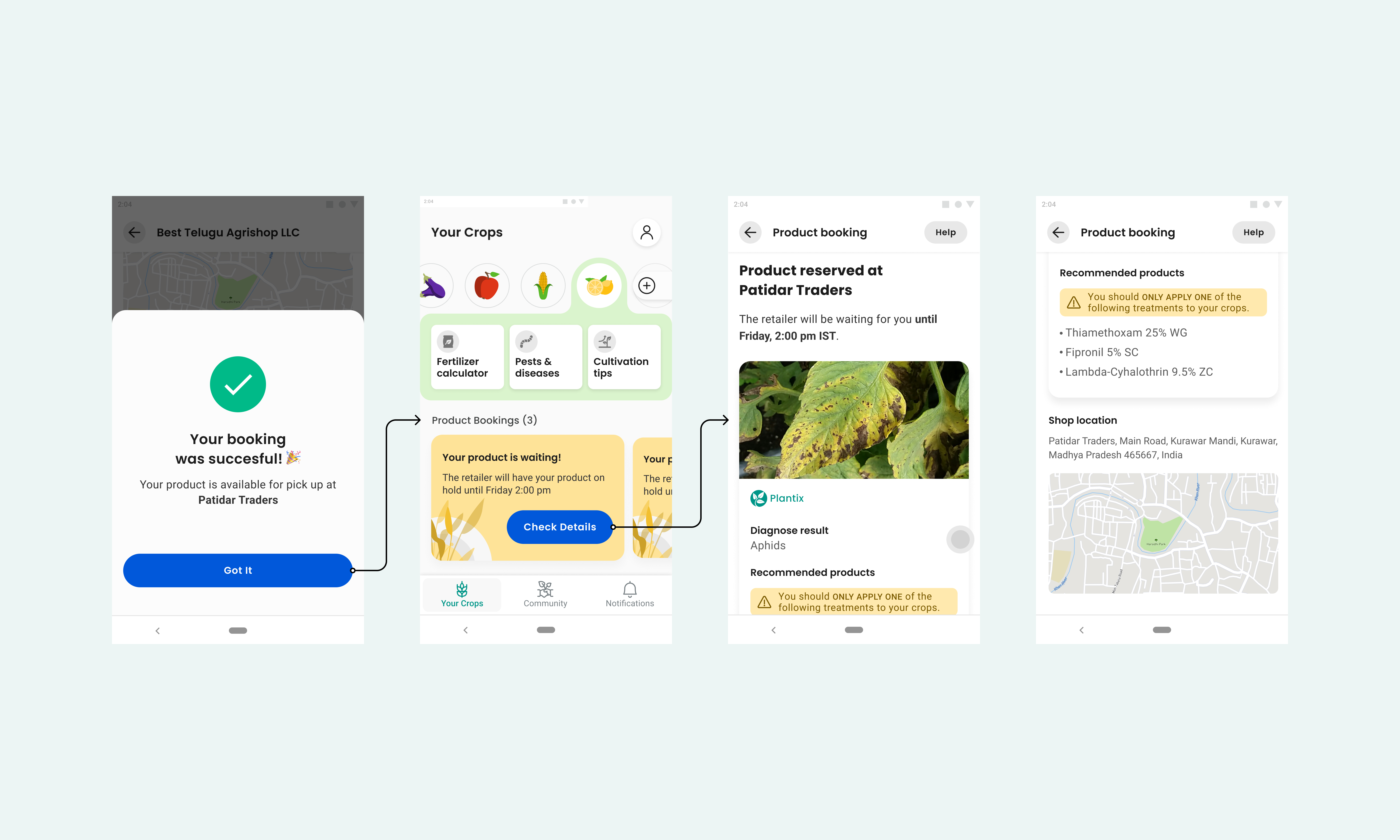
The needs were clear: help finding the right product · ( trustworthy ) retailers · ( clarity ) on the booking process.
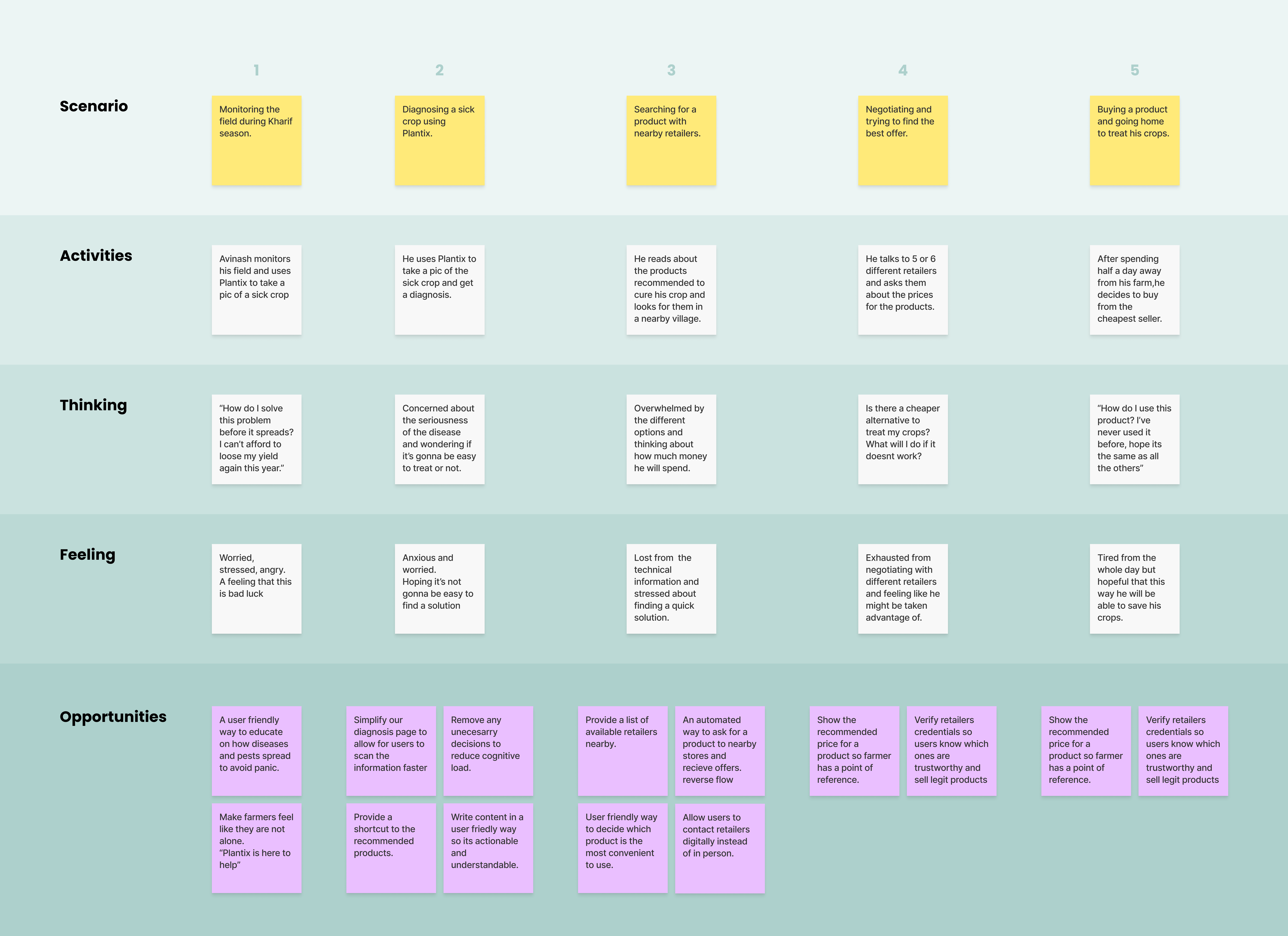
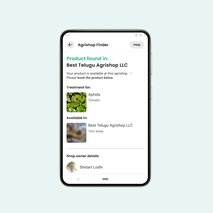
Transparency as the core design value.
Trust was the biggest barrier, so I made ( full visibility ) a design principle — farmers can see exactly what's happening at every step of the booking. Backed by our Plantix Partner network of 10,000+ stores, farmers could understand what they needed, where to get it, and how — and choose the best option for themselves.
- A help / FAQ section answering the most common questions right where doubts appear.
- A clear success flow confirming the booking.
- A branded, shareable component — because farmers love sharing useful finds over ( WhatsApp ), we designed something they'd want to save and pass on.
Calmer decisions, measurable lift.
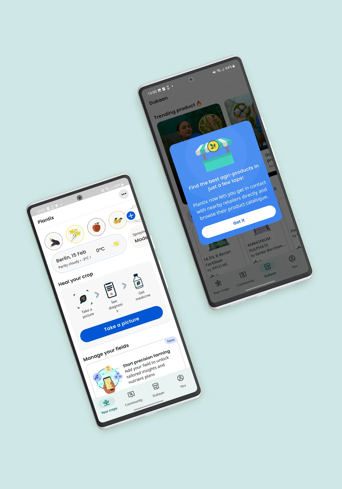
The feature later graduated into a fully integrated product, renamed Dukaan.
What I took from it.
- “Better to make half a product than a half-assed product.” The pandemic gave us every excuse to cut corners; I'm grateful we held the line with a team that shared the vision to genuinely help our users.
- Avoid assumptions. Having worked with farmers before, the hardest discipline was not jumping to solutions. The lesson stuck: you never really know anything about anyone until you ask.
- Design for dignity. Building for people whose livelihood is on the line reframed what “good UX” means — clarity and trust weren't nice-to-haves, they were the product.
Clarity and trust weren't features here — they were the whole product.
